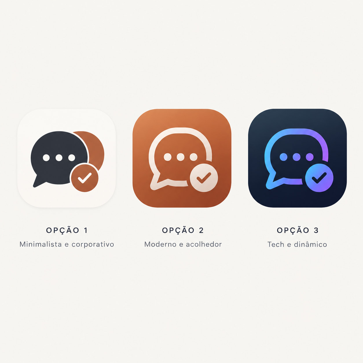
I would like to submit a visual suggestion regarding the Spark IM desktop client.
Currently, the flame icon looks very similar to the Tinder app logo (both in color palette and shape). In professional environments, this visual similarity can cause awkward misunderstandings or make users hesitant to leave the app visible on their desktops.
Since “Spark” can also mean a spark of light or electricity, here are some conceptual options that would look great and highly professional:
• A Geometric Sparkle/Star: A clean 4-point or 8-point modern sparkle icon (similar to modern AI or chat design trends).
• A Lightning Bolt / Digital Spark: A stylized electric bolt representing fast, real-time communication.
• An Abstract Node Connection: A logo representing messaging nodes lighting up.
Changing it to one of these options would keep the “Spark” identity while making it look much more modern and distinct for corporate usage. Thank you for your amazing work on this project!
Although I would love some better designs for our products, I do not recognise the particular problem that you’re stating. The Tinder library is unknown to 99.9% of people. It is an internal library hardly visible by anyone else.
Given the names of our community and projects, I quite like to have icons that are somehow related to ‘ignition’, '‘fire’, ‘combustion’ or related concepts.
Lastly, the proposed replacement is very, very similar to icons fro lm other projects. This particularly is similar to the Conversations cliënt logo, for example. I think its valuable to retain a strong, unique identity.
Logos are all looks similar and we may find hundreds or similar.
The Tinder is a mobile app, how it can intersect with the Spark on desktop in a “professional environments”?
The Tinder is probably the worst thing ever created by programmers. This app destroys humanity by allowing to cheat to your husband and by an inflated sense of pride in women, hindering them from making a sensible marriage until they grow old and lose the chance to start a family forever.
This people are worst than drug sellers.
I agree that changing the icon just because it looks similar to another app may not be necessary, especially if Spark has been using its logo for years. Still, having a distinct design could help avoid confusion and make Spark easier to recognize across different platforms.