What do you think about updating the status icons?
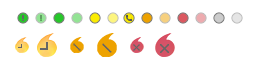
I think the bubble icons are not suitable for the new Spark design.
I haven’t decided on the color palette yet, so far.
@k33ptoo What is your expert opinion?)
Hi @ilyaHlevnoy yes it should be updated, what you’ve done so far is awesome, I think we should adopt them.
Thank you!
I would also like to replace the status icons in the tray.
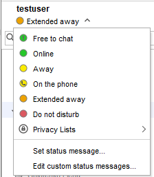
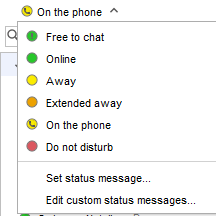
In my understanding, statuses:
Away - the user has away for a short time (AFK)
On the phone - the user is talking on the phone and it is equivalent to walking away.Therefore, the background of the icon is yellow.
Extended Away - the user is temporarily unavailable, vacation, left work earlier.
So I created a new icon for “Extended Away”, what do you think I did the right thing?
Makes sense, love the icons.
Personally, i think it is not needed to have Extended Away system tray icon as usually your screen will be off and you will not see that icon very often. Away status is mostly important for your contacts.
Btw, i don’t have merge permissions anymore, so ask someone from Ignite team to merge or maybe they can add you to Spark dev team, so you can merge yourself 
It’s very sad to hear that. Thank you very much for your contribution to this project.
This is a nightly build of Spark with new updated statuses, please tell me your opinion 
Click on "Скачать " to download