Amos Chepchieng contributes changes to refresh Spark’s appearance and make it look like a modern app.
Tracked in https://igniterealtime.atlassian.net/browse/SPARK-2214
Feel free to test and report your experience and impressions 
Amos Chepchieng contributes changes to refresh Spark’s appearance and make it look like a modern app.
Tracked in https://igniterealtime.atlassian.net/browse/SPARK-2214
Feel free to test and report your experience and impressions 
My observations:
Login fields don’t have captions and i expected there would be vanishing captions (“username”, “domain”) inside the fields. But they stay empty if you delete text. Probably still work in progress as many other things. At some point username and domain should get combined also (https://igniterealtime.atlassian.net/browse/SPARK-1792).
Accounts and Advanced buttons at the bottom of login screen have no indications they are buttons and no effect on press. Feels awkward. As there is not frame, you are trying to hit the text itself, which is harder to target. Also noticing a slight delay in Advanced menu opening.
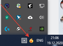
Spark is not going into systray upon pressing X in contacts window, but process is still running. Icon is missing in systray. There is no systray icon at all when Spark is running.
Roster window is always set to a wider view and is not retaining desired width and position after a restart.
No way to select from saved logins.
Chat window missing Pade, Http File transfer, emoticon picker, spellchecker and other buttons. Actually all plugins failing to expand and not working (Flashing, Roar, etc.).
Hi, here is the update regarding your observations
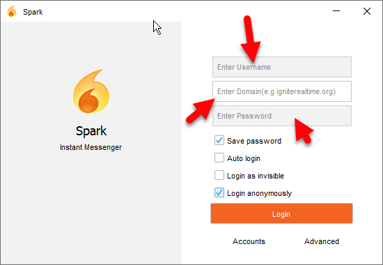
textField.putClientProperty("JTextField.placeholderText", "Enter Password");
Kindly advise further where could the problem be.
The new GUI looks really cool!
But where are the icons of History and Pligins httpupload, emoticons, translator and “wake up”
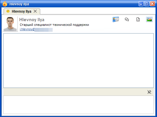
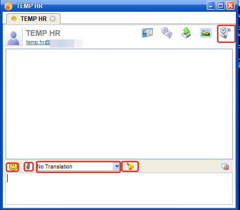
Btw, this is completely ok. We are used to break Spark completely while “work is in progress”  I am not a developer myself. Have looked briefly through the PR, but didn’t see anything obvious pointing to why plugins are not building. I’m guessing the clues must be in pom files and maybe something is missing or some things are incompatible with them. We might need help from other guys. Maybe @guus can find a minute to take a look why plugins stopped working.
@ilyaHlevnoy you don’t see icons for emoticons, etc. because plugins are not working. Same for Roar popups, transfer guard, etc. Not sure about the buttons at the top, but probably related. Systray is also a plugin, i think, like internal one.
Strange that i don’t get prompt text in the fields on login screen.
I am using installer with Java built-in. Which is old. Maybe prompts work with newer version of Java.
UPD: No, tried with Java 14 JRE and it is the same.
Btw, how you produce screenshots? Do you have Spark running in IDE? I am not running from source, but rather from installer Bamboo has produced automatically upon merging your PR. This is how it looks for me:
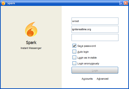
It is because the look are feel set from reference is different from the intended one i.e flatlaf, I forgot to comment out the code that sets theme from reference. Flatlaf should be the only default.
I’m running from both, the theme settings plugin in preference also failed to work where you can change the theme that’s why you see that specific look and feel but that can be fixed by setting Flatlaf LF as default from code.
Found where the problem lied for plugins will be pushing a PR soon alongside other updates.
Yes, this time it works much better and all plugins work. Also prompts and new theme appear now. Latest build with these changes https://bamboo.igniterealtime.org/browse/SPARK-NIGHTLY-1614/artifact/shared/Install4j-generated-media/
Roster window position and size is not saving still.
Most users probably don’t care and have just one login, but i do tend to switch between accounts often. So it was handy to have that drop down besides the Username field to select which account to login with.
Also, icons at the top of the chat window (user profile, invite to conference, screenshot) could be a tad bigger. It is ok in other places, especially in menus as you have the text that you can read and hit.


Ok, so position is actually saving. But not the width of a window. I have tried with fresh profile. I thought maybe this is because menu is now in the titlebar itself on Windows 10 with the new theme. But even when i login with a user which doesn’t have bookmarks and there is enough space, it still makes the window wide.
This is just a comparison how menu looks on Windows 10 and Windows 7. Because of the icon one would have to make it a bit wider to fit all the menus. Not a huge deal. Just an observation. I guess most users wouldn’t care much if the window is wider. But some might like to keep it thin, even if some menus are not visible. So it would be good to find out why size is not preserved between restarts.

The icons i mean:

Could be a bit larger. Especially when games icons are larger and currently are cropped at the bottom. This is probably not aligning with a overall theme of small icons everywhere, but for usability maybe is worth increasing the size.
Hurrah!
Finally, Spark does not hide in the tray, where my users cannot find it.
I get strange errors when I go to the Customization settings menu.
Also, my log file in the new profile contains many errors.
errors.log.0 (520.9 КБ) warn.log.0 (16.7 КБ)
Yes, i saw that too. This is probably because theme selection was removed, but i guess this window is still referencing it somewhere and creates a nullpointer exception. Which is also what is filling up the error log.
Icons aligned and resized
Also test the saving appearances, I kinda fixed that. Creating a PR shortly.
Thanks. These icons look much better now. Right click in username field also works for selecting accounts 
I am still getting null pointer error when pressing away from appearance menu. And window width is not saving.
Latest build: https://bamboo.igniterealtime.org/browse/SPARK-NIGHTLY-1615/artifact/shared/Install4j-generated-media/
Will look into it thanks.
@k33ptoo Thanks for all your hard work! love it!
Curious, would it be difficult to swap out the emoji with something more modern? perhaps googles noto color emoji set?