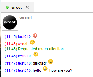
Yes, i have noticed that icons are different in emoticons (on Windows 10, on Win7 they are the same). Although, for some reason they appear a bit too high comparing to text. On Windows 7 they are also not completely aligned, but more closely in line with text.
Yay, no null pointer and it is saving the size of roster window now
Actually, emoticons are updated on Windows 7 also. I was just testing with older profile. This is a known issue that emoticons don’t get updated https://igniterealtime.atlassian.net/browse/SPARK-1918
Speedy, try deleting xtra folder in your user profile and run the Spark again. It will extract the newer icons pack instead.
@k33ptoo please don’t take all of the feedback as critique. If anything, take it as a sign that people are very happy to finally be able to work with someone that has the capabilities to make this UI update happen. You’re doing excellent work!
All feedback is good feedback, if it can be fixed or updated ofcourse. Otherwise it’s good to work on the project and give it a facelift. Will continue working on it step by step. Thank you all for your feedback
Thank you very much for the new look of Spark.
If you let me, I have a couple of moments that make me sad:
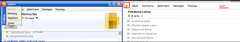
1)The logo on the left side of the screen does not work. =(
Why do I need title “Spark” in the middle of the screen? I think it should be removed.
Accommodating design to various languages is tough, especially when some languages use long phrases and more words to say what is very short in English (same problem with Lithuanian). In such case the only solution is to make UI wide, which can be ugly, or make font smaller to fit, which is not very usable. Maybe we can adjust translations to make them shorter.
Spark icon in the corner works on Windows 7 I think this might be a Windows 10 thing. Same with Spark name being in the middle. I think i saw some other apps on Windows 10 having titles in the middle. I think if you remove Spark from titlebar, it will not show Spark name in the taskbar also, which is not good. Btw, double clicking on Spark icon in the corner of titlebar works the same as double clicking on a systray icon. Spark is minimizing. This is weird That icon is repeating what the regular minimize, maximize and close do (on the right corner) so i guess this is not a big loss.
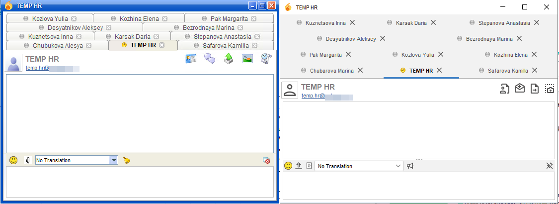
By bookmarks you mean tabs. Yes, they are bigger, which is i guess part of the overall flat theme. Same with no borders. I think this is just a design choice. Not sure how flexible @k33ptoo is/feels about changing this. Not sure if current flat theme is only for Spark or for some other projects as well. Personally i don’t mind this. Yeah, this is part of a new look and flat, spacey designs are popular now.
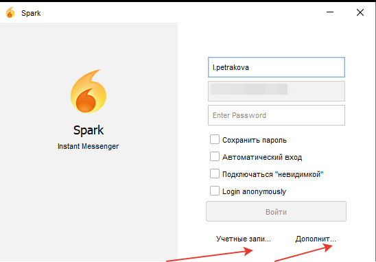
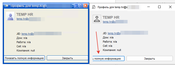
Never liked how “учетные записи” sounds and looks. This is not about accounting (finances), but about login. So maybe just use English sounding variant as Prompt suggests https://www.translate.ru/dictionary/en-ru/account - “Аккаунты”. “Показать полную ирформацию” can be just “Детали” or similar.
@ilyaHlevnoy thank you for pointing out those issues and feedback as @wroot has said the UI might turn ugly sometimes when you allow too much flexibility which i agree, I think I would go with @wroot suggestion of changing the translated words where possible. Also the icon issue has been answered correctly.
What i would be working on though will be the tabs thing, luckily there’s a solution for limiting the number of visible tabs and showing the excess as a list which will come in handy here and keeps the UI clean and neat unlike currently, I will be sharing when am done.
Thank you.
@wroot I feel like we are getting close to a release!
@R87A, any interest with helping to add a few must haves before a release? thinking that spark could use carbons, omemo (or at the very least updating the OTR plugin), and perhaps moving to jcef now that they have regular binary builds and resolve the linux issue? If so, lets break this to another thread. @wroot what are you thoughts?