Thanks. Latest build with scrollable tabs https://bamboo.igniterealtime.org/browse/SPARK-NIGHTLY-1643/artifact/shared/Install4j-generated-media/
1 Like
Unfortunately, I will have to retire for a couple of months. But then I would like to continue my participation in the work on Spark.
3 Likes
We’re grateful for all of the work that you’ve already put in! I hope to see you back eventually!
3 Likes
yes, we are very grateful, and we look forward to hearing back from you. Best wishes!
2 Likes
New tabs are awesome!)
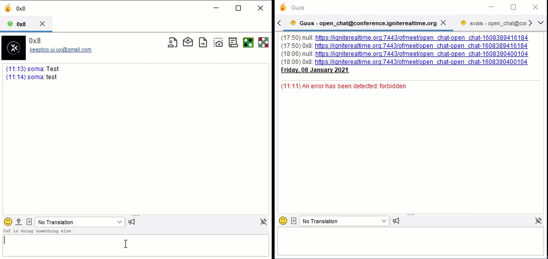
But I have thoughts that users might miss messages
If, for example, I have 10 dialogs, and a new message has arrived in the first dialog, then Spark will flash, but when I click on the “down arrow” Spark will stop flash. I think users might get confused and miss an important message.
I think the “down arrow” and the user should be made red as it is on the wide tab.
1 Like
looks awesome! Can the tabs be reordered and pinned like in a web browser?
Can the tabs be reordered and pinned like in a web browser?
Is that a question or a feature request?
both I guess…if they can’t be reordered and pinned, then they should be! 
It was always possible to drag tabs to reorder (works in this variant also). No option to pin though. And i don’t think this is very relevant for most users.
i agree! thanks for testing!
I changed the phrases so that they are not too big.
I also added the missing translation.
It looks neat now
1 Like
Thanks. I have created a ticket for that https://igniterealtime.atlassian.net/browse/SPARK-2217
And this is the build containing these changes  https://bamboo.igniterealtime.org/browse/SPARK-NIGHTLY-1645/artifact/shared/Install4j-generated-media/
1 Like
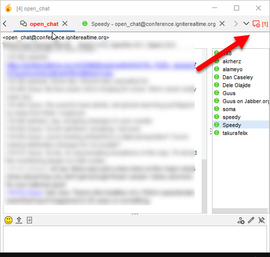
@ilyaHlevnoy I tested this scenario and noticed when there is a new message the tab is focused so I think it is sorted for now but still needs improvement either using system notification via tray icon when the window is not focused. Also noticed there is delay and probably threading issue when a new message comes [window freezes slightly]. Otherwise thank you for this.
This is actually very bad. New messages shouldn’t take over the focus. It was an issue before and was very annoying when you type a message for someone and suddenly your focus switches to another tab because you received a new message. It was finally fixed in current versions of Spark and i don’t want this issue to be reintroduced. We need to figure out something without focus switching. As Ilya mentioned there should be some indication that new message is waiting in another tab (currently it is bolded red name, could be bolded name, could be some icon in the tab, like a blue dot or something). It does switches to red when not scrollable pane is used, so new theme is not blocking that. Just need to add similar effect to scrollable pane. Also it could show a number of missed messages somewhere besides the dropdown to reach more messages. So this way you would know that there are new messages in a tab that is not visible. If this is too complicated, i would vote to go back to simple tab pane. I prefer not to lose functionality and user convenience over nicer look. Yeah, tabs take more space. We can live with that. We will get less complaints about that than about missing messages 
Working on something let’s see how it goes.
1 Like
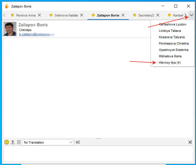
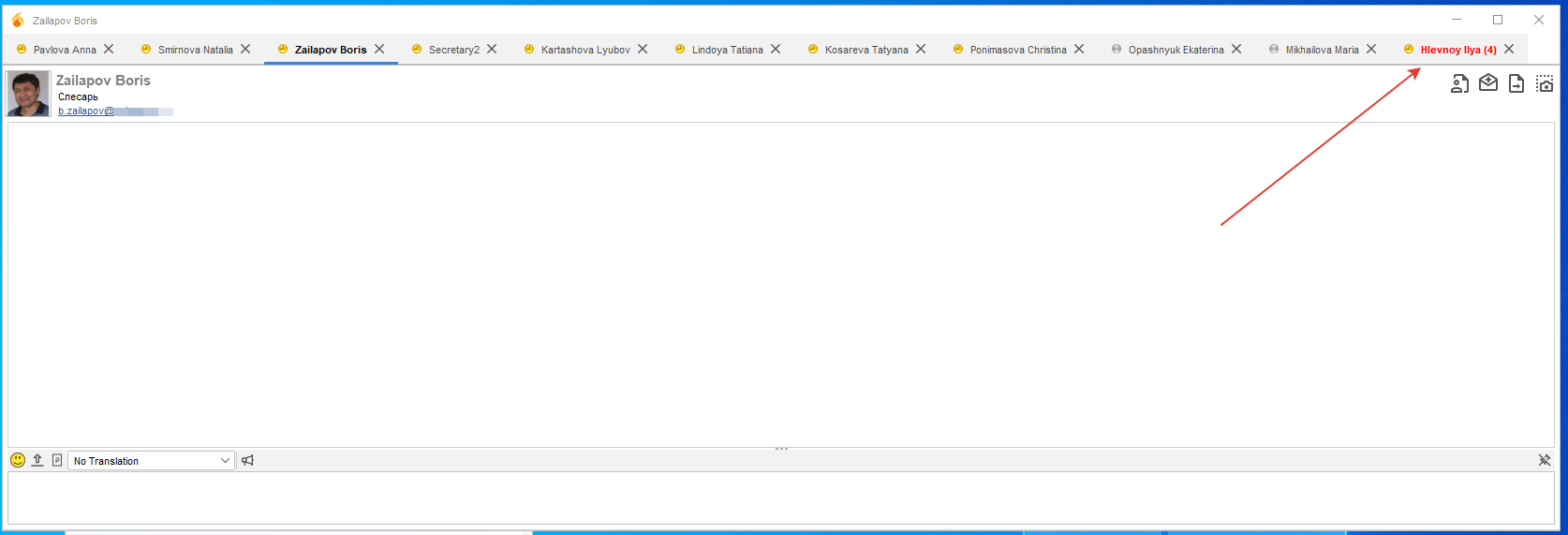
You are so fast with solutions. We might get used to it This looks great. i wonder what it shows if you don’t press on that red icon and just scroll to the unread tab? You might have a unread messages in a few different tabs as well. So this icon should stay red if there are still some unread tabs.
1 Like
I found two more unpleasant moments:
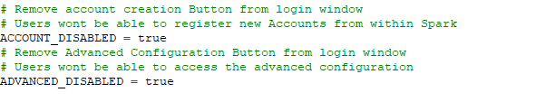
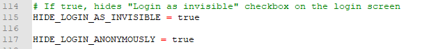
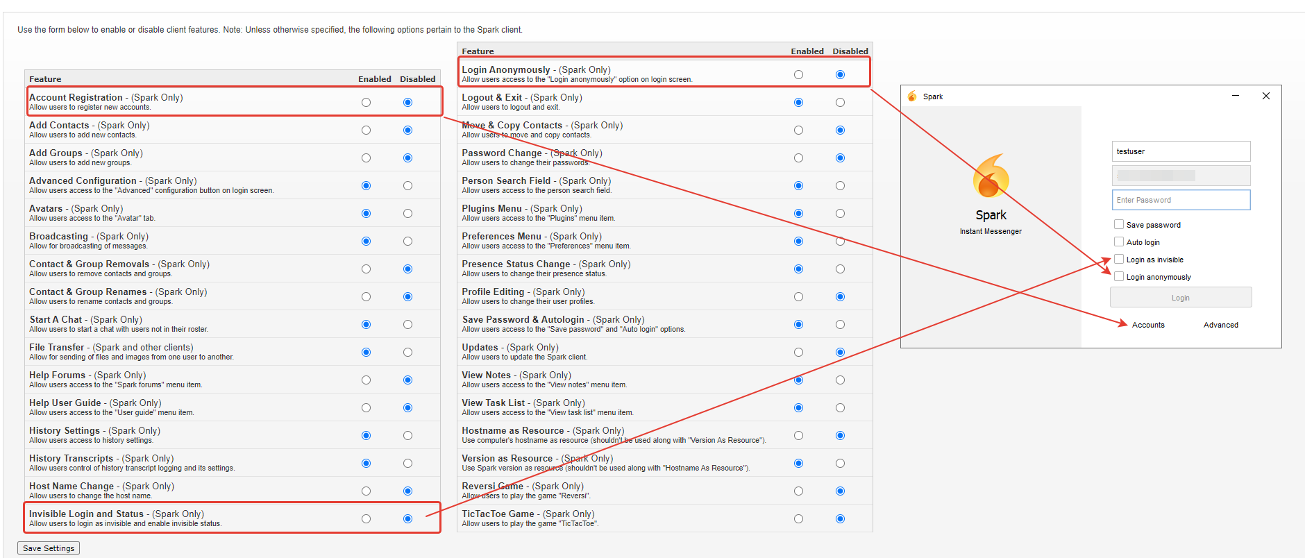
- I use Client Control and disable Login Anonymously and Invisible Login, but Spark 2.9.5 still shows these menu items. I’ve tried disabling them via default.properties, but they still show up.
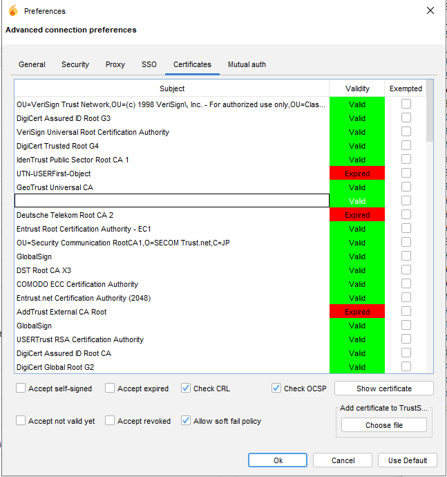
2)When choosing a certificate, the selected line turns white and I do not see the certificate.
Thanks @wroot, added unread count, this can work as is but needs to be improved - when one tab is clicked there are still unread from another user so it should stay visible and show the remaining unread count - should not be visible when count is zero. Someone can jump in and help with that - Code is in DefaultTabHandler, SparkTab and SparkTabbedPane classes - added todo comment on it.
Have seen where it is I’ll fix it.