welcome back from your break! are you sure you took enough time off! 
the igniterealtime.org xmpp server is being used to test new code, and is also running in a cluster. There may be some strangeness being caused by it.
welcome back from your break! are you sure you took enough time off!
the igniterealtime.org xmpp server is being used to test new code, and is also running in a cluster. There may be some strangeness being caused by it.
Thank you, well I can’t say it was enough  but it was good. So could be the reason it behaves that way sometimes.
Latest build https://bamboo.igniterealtime.org/browse/SPARK-NIGHTLY-1677/artifact/shared/Install4j-generated-media/
I am not sure which issue you had in mind when you said it only happens on igniterealtime server. The one where first tab is not showing number of unread messages is old one and it happens on my test server also (it is also Openfire, 4.6.1). https://igniterealtime.atlassian.net/browse/SPARK-2222
The drop down arrow still doesn’t show correct view of unread messages. It shows (x) besides some names, but not all of them. Like if you have two tabs with missed messages in drop down it shows (x) number only for one of them.
If i someone new (no open tab) sends me a message, it opens a new tab at the last position and shows red color, number of messages, but doesn’t takes focus to that tab. But if another person sends me a message, new tab opens at the last position and it gets the focus to that tab. This shouldn’t happen. Focus should always stay in the current tab.
The dropdown showing the number is related to the bug you just added to Atlassian, since it just takes the title of the tab no coding there. Also the one focusing the tab on new message is an issue that existed, something to be fixed.
I understood what was happening.
When the user writes one message, the counter does not appear.
I never noticed this because this is the usual behavior of tab.
Unfortunately I have no control of the dialog, the dialog should work alongside the tab title with - this [User(1)] number of unread messages displayed.
Yes, Ilya is right. As drop down is only listing names of tabs, maybe we can then change so Spark would not just highlight a tab when one message is received, but add the (1) to the name. It would be a more consistent design to always show how many messages are unread in a given tab. Not sure if Amos can find where to change that.
As I mentioned on the previous comment, the feature works, the number of unread messages per tab is shown next to the name of the sender, the feature however is inconsistent, when testing on local server it shows perfectly even on the dialog but when you switch to online server - igniterealtime.org it fails to show most of the time as @ilyaHlevnoy had mentioned and acknowledged it was an existing bug, moving forward, we need to find out where and why it behaves like that on local and online servers.
I am testing both on igniterealtime.org and local server.
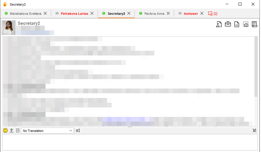
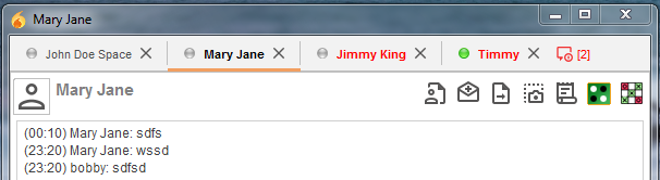
The bug ticket which i have created is only about the first tab in chat window. It always only shows red text and no number of messages, no matter if it is scrollable tabs or regular tabs in 2.8 version.
What i was speaking about is all the rest of tabs are not showing (1) when only one unread message is received. This is most probably by design. Someone creating this feature decided that there is no need to show (1) for just one message and only red text in title is enough. But now with scrollable tabs we run into an issue that for just one message in dropdown it just shows a tab title and you can’t distinguish from tabs with new messages and not (because in dropdown you can’t have red text). So my suggestion was to change the code to always show number of unread messages, even if only one message is unread. This won’t fix the first tab bug, but at least it will make it easier to find unread tabs in the dropdown menu.
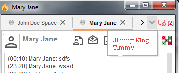
I mean this. Two tabs have only one unread message (they are not first):
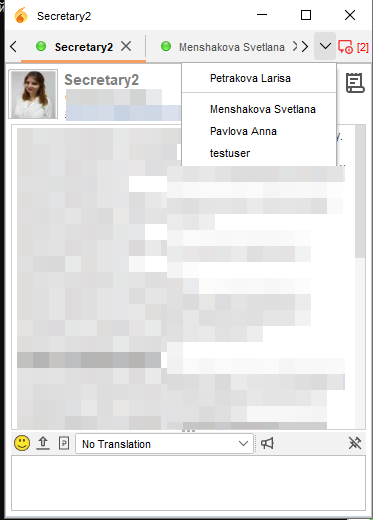
In dropdown they only show names as there is no (1) added for any tab with just one unread message:
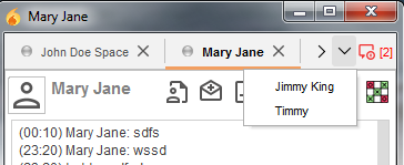
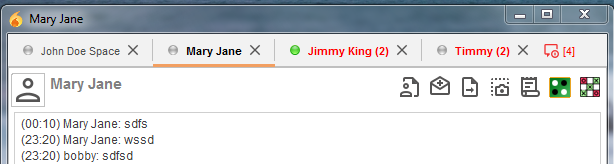
To compare, when more than one message is received, they show numbers:
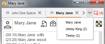
Only first tab is not showing (2) or (3) or any other number.
Or you can not change the logic of the tabs and paint unread messages in red.
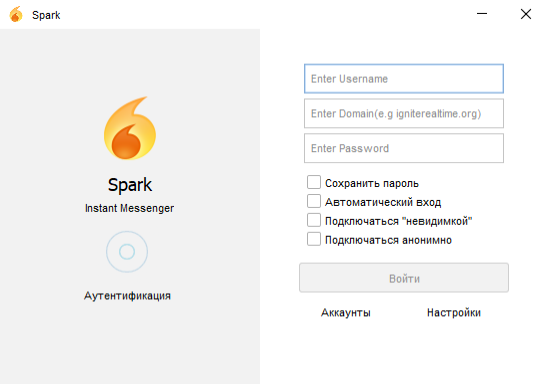
I like the old (old school) look of Spark login, but i also kind of like this “open book” view. This also allows in future add more options on the right panel without having to cram them into the bottom part and make Spark login window super tall Also, this is the idea that Amos came up with and i don’t want to alter his idea too much. We need a fresh look. So lets not try to bend it to look kind of like it was 
Also, most people will have auto login on and won’t see it at all
I also like the design of the open book. 
Fixed.
Great, it works! Thanks.
Latest build https://bamboo.igniterealtime.org/browse/SPARK-NIGHTLY-1685/artifact/shared/Install4j-generated-media/
Only that bug with the first tab exists. Hopefully we can figure this out at some point as well.
Sure we will.
Hello. Thank you for your work on this - It looks really good! One question about the items in the top bar of the main Spark window. In this new version, thing like “File, Contacts, Actions, Bookmarks, Help” are in the top bar, but are also larger font. In order to see all of them, we have to make the Spark main window much wider/larger - which creates a lot of white space in the username list. Is it possible to:
Again, than you so much - it looks great!
-Joel
I don’t think making font smaller is a good idea. Not sure if it is even possible in this place. Menu appears in the titlebar area only on Windows 10 (it is still on a separate row on Windows 7). So it could be because of how Windows 10 handles things.