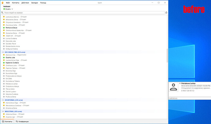
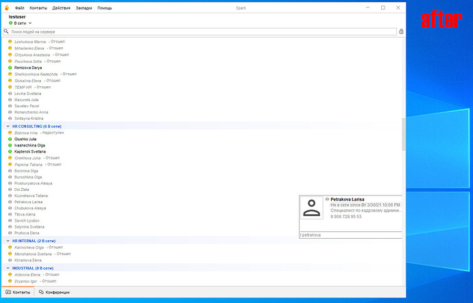
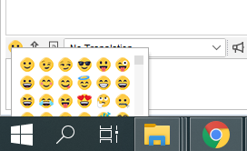
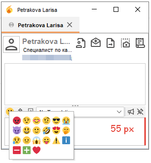
This will not help if bigger emoticons pack is used and chat window should be used to show conversation, not a huge empty input box 
Yes, I also saw what is happening with emoji POPO, but I saw this screenshot and there is a scroll.
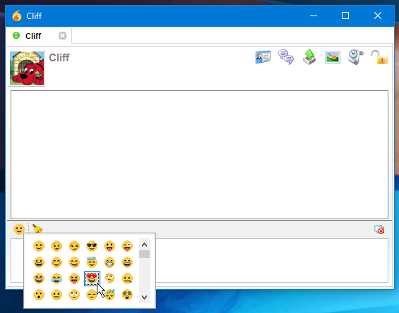
To solve the problem with emoticons, I suggest:
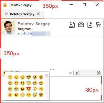
1)Fix the chat area just a little higher and prevent the chat from shrinking.
2)If the emoticons are large or there are a lot of them, then show the scroll and do not allow the window to go beyond the border of the main window.
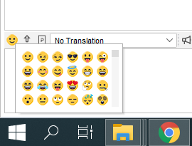
what do you think of using a single icon for emoticons?
I think the design will look even better, here’s an example:
![]()
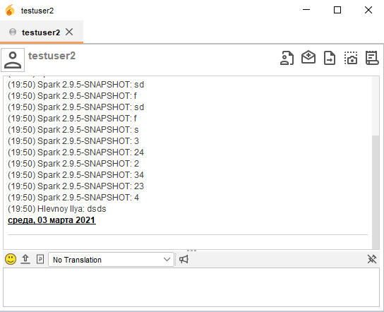
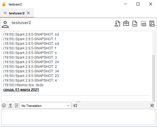
Personally, no. Because emoticons are colorful, so the icon is showing you what you will get. And i don’t like the window being completely monochromatic. So i like little hints of color here and there (Spark logo in the corner, color bubbles for status, colors in games icons, emoticon picker).
To keep this topic afloat and not to forget things, this is the list that i think we need before this refresh is considered done (of course, there can still be other things to polish, etc.):
Major:
- A tab with offline contact takes over focus when this user sends a message after becoming online
- First tab not showing (x) for unread messages
Minor:
- Vcard popup not showing when contact window is maximized
- When chat window is maximized emoticons selection window goes beyond taskbar
- Make hint text in input fields on login screen translatable (LoginUIPanel.java)
- Move search field to the top of contacts window (now at the bottom)
Trivial:
- Small glitch around looking glass icon in the search field
- New emoticons (without white border)
- Add contact icon in Contacts menu should use the same icon as in chat window (just smaller)
- Move Lookup profile setting in Contacts menu higher
Although most of this seems like we can live with it or fix it later (i really want to fix two first ones, but most users probably won’t run into this too often).
A post was split to a new topic: Error or Fedora Linux
Hi, regarding this
- A tab with offline contact takes over focus when this user sends a message after becoming online
I found some code in ChatContainer.java class where a tab is focused when it has idled for longer than 20 seconds, I commented out that since it wasn’t, Kindly test it if that could have been the one causing above issue.
Applied your patch. Quick test showed good result. No stealing of focus. Thanks!
https://bamboo.igniterealtime.org/browse/SPARK-NIGHTLY-1742/artifact/shared/Install4j-generated-media/
Awesome.
@wroot @k33ptoo Hi ![]()
Do you think these bugs are blocking the release of the new Spark?
I think the release of Spark with a new design might attract new developers.
The vcard popup is shown to the right of the user list. I think I need to show the VCard window inside the user list if fullscreen is enable.
I see that the default window size is 300 x 300 px and the input area 55px…
I think I need to make it bigger, at least 350x350px and make the input area 80px.
I understand that big PoPo emoticons will be out of scope, but this will help for the standard emoticon pack(16x16px)
I think these bugs are minor and can be fixed later (with something smarter than making input box bigger). I know there are a few things that can still be fixed (or what you want to fix), but i think it is enough to at least do a beta release and let more folks know about it and test.
@akrherz would you mind helping us with a beta release? I can come up with a blog post for that. Let’s make it 3.0.0. New look warrants the new major version 
Created tickets for rest of issues:
https://igniterealtime.atlassian.net/browse/SPARK-2227
https://igniterealtime.atlassian.net/browse/SPARK-2228
@k33ptoo we have released beta for 3.0.0 Spark 3.0.0 Beta Released Thank you for your contribution and lots of patience 
Hello.
Thank you very much for the new look and feel!
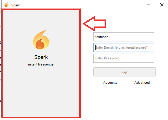
One question: can I customize the left area on login?
Thanks.
Alessandro
Thank you for the question, not customizable, we can provide an option to hide or show for that if absolutely necessary.
